Tips to Help Select the Right Color of Paint for your Room
Selecting the right neutral paint color can be challenging. There are so many considerations: many colors are so similar, how will the type of light affect the color, or what sheen should be used in the space.
Here are some easy tips to help sort through this conundrum.
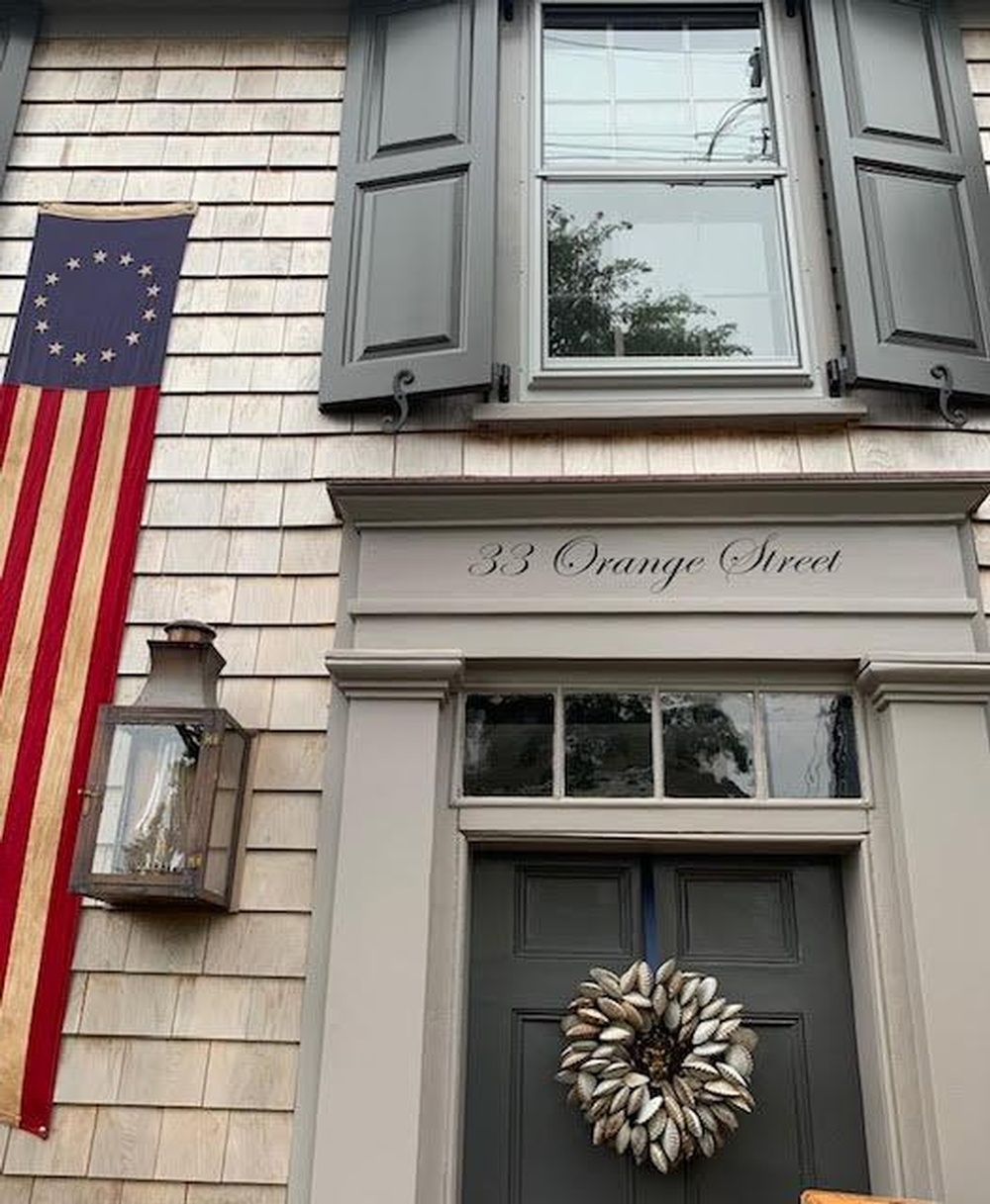
Whites are the most basic neutral yet there are so many subtleties and nuances of this color. Think of them as warm, neutral, or cool. The warm whites will often have a creamy undertone, the cool whites will have a slight tinge of gray, and the neutral whites will be neither too cool or too warm. Some good classic creamy whites are Benjamin Moore’s White Dove and Navajo White. Some cool whites are White Wisp and Winter Orchard. A good go-to crisp white that is good for both a warm and cool color palette is Snowfall White because it can be used well with both beiges and grays. A slightly stronger and deeper neutral color is a greige called Alaskan Skies.
When selecting a paint color, always choose it in the light that will used be in the space. Natural daylight is very different than the light from a bulb. Today there are so many colors and types of light bulbs from the standard incandescent to the long-lasting LEDs. The range of color these bulbs produce is very different and can significantly change how the paint color is perceived.
Which paint finish to use is another common question. A modern approach with the whites is to use matte on the walls, the same color in a different sheen for the trim, and flat on the ceiling. This is a refined and sophisticated approach to painting a room that is particularly effective in a space with molding and millwork. The colors will appear slightly different and well-coordinated.
One last thing to consider when selecting the color palette for a room is that in addition to neutrals that are white, there are some colorful tones that can coordinate well in a neutral space. Navy blue, orange, and charcoal gray are examples of popular colors that go well as accents in a room. Hale Navy is a good true navy blue that is great for a kitchen, dining room, or bedroom. Symphony blue offers a dark more richly saturated marine blue.
Another approach for making a strong statement with neutrals is the use of soft dramatic off-blacks or deep grays. Deep Royal is a blue black and Gentleman’s Gray is darker gray tone with a lot of depth. On the opposite end are the sophisticated light blue grays. For colors that don’t look like a baby’s room try Brittany Blue or Parma Blue.
With the myriad of options for color, there is much to be considered and the professionals at Atchison Architectural Interiors are there to make sure you get it right.
JEAN ATCHISON

Diane H Reilly Photography
Atchison Architectural Interiors designs classic and timeless spaces infused with a chic modern vibe. By merging classic and contemporary elements, the team creates fresh, sophisticated looks. Their interiors are elegantly balanced, carefully edited, and current with a thoughtful mix of furnishings, textures, finishes, and objects.
Whether your aesthetic is contemporary or classic, nationally recognized interior designer, Jean Atchison, will work closely with you to bring your vision to reality and create a home that is uniquely your own.